The subreddit r/DataIsBeautiful is one of the most popular communities on reddit and its members have become well-known for creating original and engaging content that helps us all make better sense of the world.
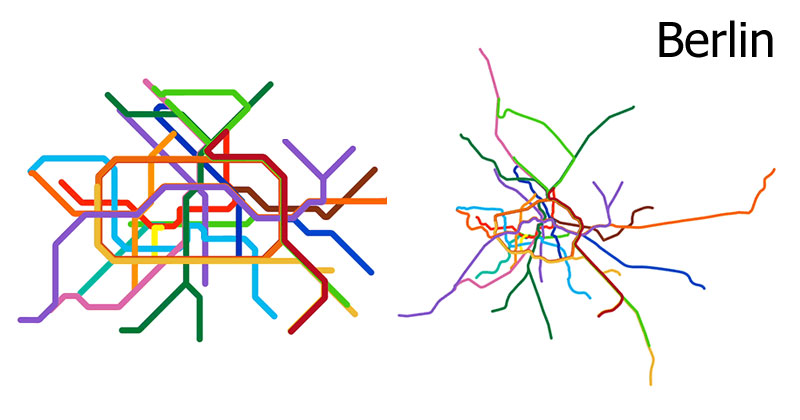
A recent post by vinnivinnivinni that recently went viral showed an animated comparison of the Berlin subway map vs its actual geography.
The post inspired a lot of other community members to create equivalent maps for cities around the world and now most of the major subway systems have gotten the same animated treatment.
Below you will find 15 animated subway maps compared to their actual geography. You can find links to the original post under each image to learn more about how it was created and which source maps were used.
If you haven’t already, be sure to check out r/DataIsBeautiful, but be warned you may spend a lot of time on there!
[via r/DataIsBeautiful]
Berlin
Paris
London
New York City
Vienna
Rotterdam
Tokyo
Washington D.C.
Singapore
São Paulo
Oslo
Shanghai
Barcelona
Montreal
Austin
