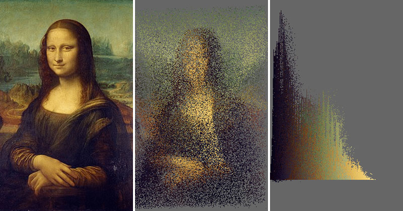
Data is Beautiful is a fascinating subreddit described as: A place for visual representations of data: Graphs, charts, maps, etc.
A recent submission by reddit user anvaka included not just a dazzling visual but an elegantly written javascript code which he has made available on GitHub.
To create color analysis graphs like these, anvaka wrote a script to do the following:
Took color of each pixel in the image, made L component (i.e., Lightness) of the HSL color space as X coordinate, Y coordinate corresponds to number of pixels with given L value. Used interpolation function to move pixels from their original position to the destination over randomly assigned number of frames. [source]
For those unfamiliar HSL colors take three values:
– Hue is a degree on the color wheel; 0 (or 360) is red, 120 is green, 240 is blue. Numbers in between reflect different shades.
– Saturation is a percentage value; 100% is the full colour.
– Lightness (used above) is also a percentage; 0% is dark (black), 100% is light (white), and 50% is the average.
This gives a very wide spectrum of available colors and tones. [source]
Below you will find more examples of animated color graphs made by various reddit users using anvaka’s code. To try yourself, check out GitHub. You can also find the original thread on reddit here.
Reaction Bonus
