
Earth’s population recently surpassed 7 billion people and that number is still growing. To comprehend the composition of our species 100people.org sought to help people, “better understand the complex issues facing our planet and the resources we share by framing the global population as 100 people”.
Below I have compiled the statistics on 100people.org into 14 image macros that will hopefully help you visualize and understand the Earth and the people who inhabit it.
If you would like to see the sources of the statistics below, click here and scroll to the bottom of the page for the websites used for each statistic.
1.


Statistics via 100people.org
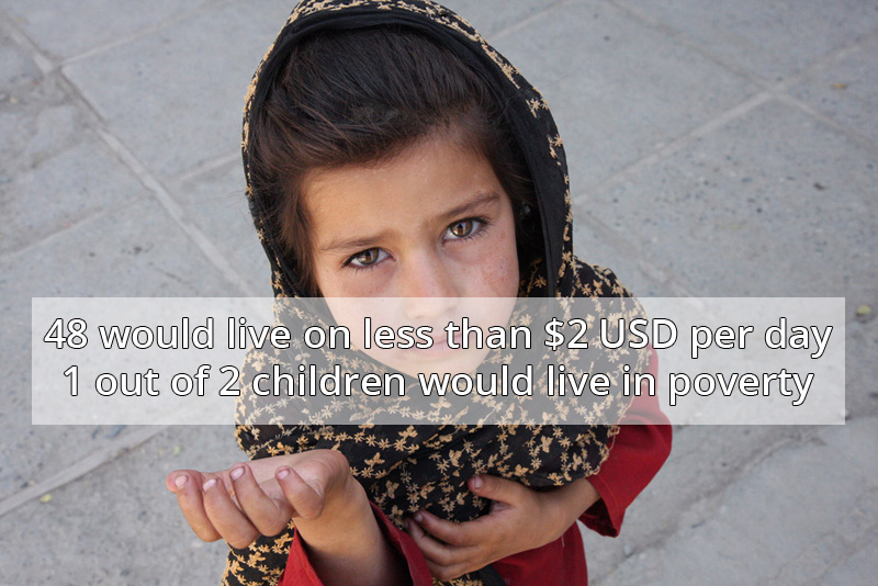
2.


Photograph via wonderless2686
Statistics via 100people.org
3.


Statistics via 100people.org
4.


Statistics via 100people.org
5.


Statistics via 100people.org
6.

Photograph by CollegeDegrees360
Statistics via 100people.org
7.


Photograph by David Goehring
Statistics via 100people.org
8.


Photograph by Paul Mayne
Statistics via 100people.org
9.

Photograph by Kristina Alexanderson
Statistics via 100people.org
10.


Photograph by Robert S. Donovan
Statistics via 100people.org
11.


Photograph by Enid Martindale
Statistics via 100people.org
12.

Photograph by Evstafiev
Statistics via 100people.org
13.


Photograph by Chris 73 / Wikimedia Commons
Statistics via 100people.org
14.

Photograph by rafoto on Flickr
Statistics via 100people.org
If you enjoyed this post, the Sifter
highly recommends:


