Design by Tezuka Architects | Photograph by Katsuhisa Kida
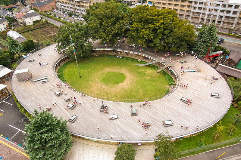
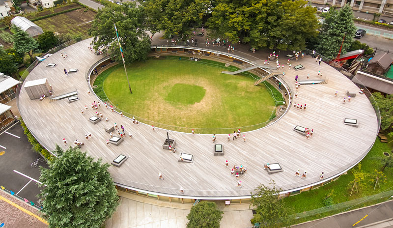
At the award-winning Fuji Kindergarten in Tokyo, children run endless laps around a ringed roof that doubles as a playground. Completed in 2007 by Tezuka Architects, the Montessori can accommodate up to 600 children aged 2-6.
The continuous space allows children to freely explore, discover and interact with their environment. There is no play equipment installed and the roof is only 2.1 metres tall (6’8″), allowing a close connection between levels. Children can scramble up a bank and climb a set of stairs to reach a slide from the deck back to the ground.
Design by Tezuka Architects | Photograph by Katsuhisa Kida
“Just as a fish cannot live in purified water, children cannot live in a clean, quiet and controlled environment,” says Takaharu Tezuka. And when the children first started interacting the building it was an emotional moment, Tezuka tells Dezeen: “It was simple, they just started running, said Tezuka. “It was beyond our expectations. I was sitting with the principal and everyone had tears. It was amazing, an instant reaction.”
Design by Tezuka Architects | Photograph by Katsuhisa Kida
Design by Tezuka Architects | Photograph by Katsuhisa Kida
Design by Tezuka Architects | Photograph by Katsuhisa Kida
“We had to build around the trees already there on the land. It wasn’t easy — we couldn’t cut the roots, which spread as wide as the tree crowns. We added these safety nets so the students wouldn’t fall through the holes around the trees. But I know kids, and they love to play with nets. Whenever they see a hammock, they want to jump into it, to shake it. These were really just an excuse for me to give the kids another way to play.” [source]
Design by Tezuka Architects | Photograph by Katsuhisa Kida
Design by Tezuka Architects | Photograph by Katsuhisa Kida
At ground level, sliding doors allow the classrooms to be open to the elements during good weather. Instead of dividing walls, the architects created child-sized boxes made from light wood with rounded edges that can be stacked to create shelves and display areas.
Tezuka believes standard classroom design is unnatural and counter productive to a positive learning environment. The free plan design encourages independence and collaboration, without forcing children to sit still and silent for long periods of time.
By leaving the classrooms open, the sound of 600 children creates the level of white noise found in natural environments. Tezuka got the idea when he met the composer and molecular biologist Tsutomu Ohashi while on holiday in Bali.
Listening back to a recording of an Indonesian music performance Ohashi invited him to, he realised the sound was obscured by the noise of the jungle he had been able to unconsciously filter whilst watching the show. [source]
Design by Tezuka Architects | Photograph by Katsuhisa Kida
“Japanese building code says you have to have a vertical handrail with bars 100 millimeters apart so the kids can’t put their heads through. But: They can put their legs in, and kids love to swing their legs. Chimpanzees do the exact same thing — it’s a kind of instinct. And the way they do that is so cute.” [source]
Design by Tezuka Architects | Photograph by Katsuhisa Kida
“The kids love to look through the skylights from the roof. ‘Where’s my friend?’ ‘What’s going on underneath in class?’ And when you look down, you always see kids looking up from below. Here, distraction is supposed to happen. There are no walls between classrooms, so noise floats freely from one class to the other, and from outside to inside. We consider noise very important. When you put children in a quiet box, some of them get really nervous.” [source]
Design by Tezuka Architects | Photograph by Katsuhisa Kida
“We put in a small mound of dirt at the bottom of the stairs leading from the roof — this was a trick to make the stairs shorter. But then the children started taking away the dirt to make mud bowls — 600 kids take mud away, and the mound started to disappear! The school had to keep asking the construction company to put mud back. (As the soil got harder, the kids stopped taking it home.) See the slide? I knew kids love to slide, but I actually wasn’t very keen on putting it in, because it tells children what they should and shouldn’t do. Without tools, the kids have to think for themselves and create games. But in the end we kept it: We needed a fire escape.” [source]
Design by Tezuka Architects | Photograph by Katsuhisa Kida
“These days Japanese kids only talk to computers. I hate it. I thought, if we put a well in each classroom, they’ll be forced to talk to each other. There’s a phrase in Japanese, ido bata kaigi, which means, ‘conference around the well.’ Women used to meet and exchange information when they went to get water. I wanted the children to do the same.” [source]
Design by Tezuka Architects | Photograph by Katsuhisa Kida
Design by Tezuka Architects | Photograph by Katsuhisa Kida
“Every month at Fuji the teachers and kids rearrange the classroom furniture. This little boy and girl were supposed to help make a new configuration, but they’re playing train instead. We filled the school with about 600 of these boxes, which are made from this very light wood known as kiri wood. It won’t hurt the kids if they hit their heads on the corner.” [source]
Design by Tezuka Architects | Photograph by Katsuhisa Kida
Design by Tezuka Architects | Photograph by Katsuhisa Kida
Design by Tezuka Architects | Photograph by Katsuhisa Kida
“In 2011, we built an annex to the school with two more classrooms and some playing areas. We called it ‘Ring around the Tree,’ because when the architect Peter Cook visited he said it reminded him of the song ‘Ring Around the Rosie.’ I thought the tree should be more important than the building, so I made the building as light as possible. In this school, children are encouraged to climb trees. If a kid is strong enough, they can reach the upper level without using the stairs. Other schools might not allow this, but the principal here believes children know their own limits. They stop when they have to stop.” [source]
Design by Tezuka Architects | Photograph by Katsuhisa Kida
In 2017, the kindergarten was awarded the Moriyama RAIC International Prize, which recognises a work of architecture considered “transformative within its societal context”.
Design by Tezuka Architects | Photograph by Katsuhisa Kida
Sources
– Tezuka Architects official site
– TED: Inside the world’s best kindergarten
– Dezeen: Tokyo kindergarten by Tezuka Architects lets children run free on the roof
– Arch Daily: Tezuka Architects’ Fuji Kindergarten Wins 2017 Moriyama RAIC International Prize
