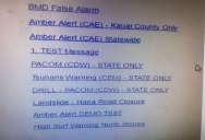
The Menu for Hawaii’s Emergency Warning System is a UX Nightmare
by twistedsifter

On Saturday January 13th, an employee for the Hawaii Emergency Management Agency accidentally pressed the wrong button (actually a text link), sending out a state-wide alert that warned a ballistic missile thread was inbound to Hawaii and to seek immediate shelter.

For 38 minutes, panicked and confused citizens and tourists scrambled for safety as mass-confusion and understandable hysteria swept the islands. A follow-up messages of a false alarm was eventually broadcast, and order was restored.
After days of investigation, a screenshot of the Emergency Warning System emerged, and the design is a UX nightmare. For those curious, the operator clicked the ‘PACOM (CDW) STATE ONLY’ link. The ‘DRILL – PACOM (CDW) – STATE ONLY’ link is the one that was supposed to be clicked.
To rectify the issue and prevent future accidental warnings, the agency added a ‘BMD False Alarm’ text link at the very top which can be pressed in case of an accident..

Sources
– Honolulu Civil Beat
– Tulsi Gabbard
– Digg
Categories: DESIGN, SCI/TECH, STORIES
Tags: · fail, government, hawaii, programming, UX

Sign up to get our BEST stories of the week straight to your inbox.


