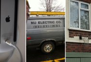
25 Examples of Crappy Design
Crappy design is everywhere and a community of 300,000+ redditors is dedicated to finding the best of the worst.
The subreddit /r/CrappyDesign (which is completely rendered in comic sans) finds poor design everywhere; from products to communication, and everything in between.
Below are some of the best of the worst, as decided by the /r/CrappyDesign community. For more, head over to reddit and be prepared for your palm to repeatedly meet your face.
[via /r/CrappyDesign]
1. This automatic door opener
2. The charging port on this wireless Apple mouse

3. This basketball net

4. Drop-down menus that disappear as soon as you start to scroll

5. This entry form that uses drop-down menus for your phone number

6. This terrible attempt at an Acronym

7. The reigning, undisputed, ‘forced acronym’ world champion

8. The New York City Subway stair that’s a fraction higher than all the others
9. This radiator coolant that looks like beer

10. And this floor cleaner that looks like an energy drink

11. The CGI burger in this Carl’s Jr. commercial

12. This banner

13. When you use a bar graph instead of a calendar

14. Maybe it’s just a brutally honest Venn diagram

15. Using Roman Numerals for your phone number

16. An app to rent ice ships? Oh. Apprenticeships

17. When none of the shoes shown use laces

18. Fagas Straps

19. This billboard layout

20. The new Instagram logo
21. This multiple choice question

22. When irony pops-up

23. When you go to print before proofing the layout

24. Improper use of emoticons

25. This faucet

Sign up to get our BEST stories of the week straight to your inbox.


