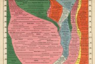
4,000 Years of World History in One Epic Chart
First published in 1931, this ambitious “Histomap” by John B. Sparks attempts to distil four thousand years of world history starting in 2000 B.C. The histomap was first printed by Rand McNally. It sold for $1 and the five foot long map was folded into a green cover. According to Slate:
“The chart emphasizes domination, using color to show how the power of various “peoples” (a quasi-racial understanding of the nature of human groups, quite popular at the time) evolved throughout history. It’s unclear what the width of the colored streams is meant to indicate. In other words, if the Y axis of the chart clearly represents time, what does the X axis (marked as “relative power of contemporary states, nations, and empires”) represent? What’s the meaning of “power” to the mapmaker? And did Sparks see history as a zero-sum game, in which peoples and nations would vie for shares of finite resources? Given the timing of his enterprise—he made this chart between two world wars and at the beginning of a major depression—this might well have been his thinking.”
If you find the text in the chart below too small, click the image to see a higher resolution. You can also view a zoomable version at the David Rumsey Map Collection.
[via Slate]
The Histomap
Four Thousand Years of World History
If you enjoyed this post, the Sifter
highly recommends:

Sign up to get our BEST stories of the week straight to your inbox.


