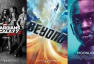
Rotten Tomatoes Best Movie Posters of 2016
The editorial team at Rotten Tomatoes just published their 24 Best Movie Posters of 2016 list along with why each poster resonated. We’ve included the gallery below along with their reasons for selecting each.
You can see more best of lists from the Rotten Tomatoes team on their blog, 24 Frames.
[via Rotten Tomatoes 24 Frames]
Cemetery of Splendor

A good year for posters putting the credits block at the top. Like cemeteries, the poster’s focus is on what lies beneath, while the green vines bathed in afterlife white fulfills the “splendor” of the title.
The Handmaiden

Like a prestigious reprint cover of a literary classic
Green Room

Besides the plum awkward, anguished pose referencing The Clash’s London Calling, the poster’s 3D vertigo effect and choice critics’ quotes (“backwoods,” “unforgiving slices”) is a fine exercise in claustrophobia.
Star Trek Beyond

The most seductive and optimistic poster of the year, from its silky colors to the whirling title treatment, which promises to go boldly past the rehashed (albeit Certified Fresh) plot of Into Darkness.
De Palma

Viewing Brian De Palma’s past subjects through curtain slats makes these movies feel dangerous and sleazy like they did back in the day. Nice touch on painting the director himself like the villain from a 1980 Bronx slasher.
Guardians of the Galaxy Vol. 2

Marvel Studios fully embraces the cassette mixtape aesthetic with gritty ’80s album black-and-white photography and oil pastel font. The soundtrack so far though remains staunchly ’70s.
Sing Street

A poster that makes its familiar premise (the tagline certainly backs that up) feel immediate and romantic again, with its torn magazine look calling back to teenage bedrooms of decades past.
Sausage Party

A disruptive poster as any to see hanging willy-nilly at the multiplex, and one we believe even Bergman would’ve admired.
The Lobster

Colin Farrell’s giant man-claws (because what else do you first think of with live lobsters) and the wisps of a woman’s hair across his face just say to the viewer, “Yep, here comes a dark sci-fi rom-com by the guy who made Dogtooth.
The Purge: Election Year

The Purge movies have ridiculously emerged as a zeitgeist-capturing series, and what describes this year more than riot gear and ol’ red, white, and blue bleeding dry?
Christine

Successfully communicates doomed anchor Christine Chubbuck’s isolation within television’s growing appetite for blood, though maybe a bit too clever considering the film’s ultimately sad, stark topic.
The Forest

Natalie Dormer’s curled lips are replaced with trees and nooses, echoing the eerie silence of Japan’s infamous open air tomb.
Suicide Squad

A pretty mess by this one band: cacophony of neon color, graphic art, and thick black outlines to make the characters pop, while rendering the credits unreadable and inessential.
They’re Watching

Natural objects rearranged to create a larger object isn’t that impressive, but a combination with the etched thick blood against blue-steel concrete gives this poster a nicely chilling effect.
The Love Witch

The sumptuous, hand-drawn, female-centered horror poster has become an annual treat, with movies like Kiss of the Damned and Queen of Earth featured in our previous year-end galleries. 2016’s highlight is The Love Witch, the Technicolor pagan throwback by Anna Biller.
Incarnate

A brutal clenched fist, with a rosary spilling over the fingers like unholy water. Wonderfully discomforting.
The Neon Demon

Remove all the filmmaker names and production companies and this would fit with the reams of ads in Esquire or Vanity Fair.
Kubo and the Two Strings

A movie with a title like this was always going to be a hard sell, so the designers decided to go all in, highlighting Kubo‘s Far East origins and promise of another take on the hero’s journey template.
Queen of Katwe

Here’s a fine shot of Madina Nalwanga wearing the game like a royal crown. And the way the chess pieces protrude directly from the skull suggests chess as a game of psychic assault.
The Divergent Series: Allegiant

This poster treatment doesn’t really have anything to do with the movie (in fact, it screams “designer doing this in their free time as clients give them infuriatingly vague directions on other posters”), but it’s effective nonetheless.
Valley of the Sasquatch

Ever since The Legend of Boggy Creek visited debased, rundown New York theaters in 1972, we can’t get enough of creature feature posters of lurching off-center monsters with movie titles splayed in yesteryear font. It’s an obsession at this point.
Lo and Behold: Reveries of the Connected World

Obviously, a visual expression of the inner workings of Werner Herzog’s brain. Somewhere in there is a good boiled leather shoe recipe.
Moonlight

Down to the tagline, one of the best-executed promotional images for a long coming-of-age movie (certainly better than last year’s cloying campaign for Boyhood).
Synchronicity

A sci-fi poster so cosmic and pretty, you just know it’s hiding a seriously low-budget project.

Sign up to get our BEST stories of the week straight to your inbox.


