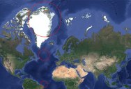
Every Circle on This Map Has the Same 500 Mile Radius

Map by Easytype on reddit
The Mercator projection is a cylindrical map projection presented by Flemish geographer and cartographer Gerardus Mercator in 1569. It became the standard map projection for navigation because of its unique property of representing any course of constant bearing as a straight segment.
As with any map of the world, the Mercator projection makes representational ‘trade-offs’. The Mercator projection exaggerates areas far from the equator, for example: Greenland appears the same size as Africa, when in reality Africa’s area is 14 times greater. [source]
Practically every marine chart in print is based on the Mercator projection due to its uniquely favorable properties for navigation. It is also commonly used by street map services hosted on the Internet. [source]
Despite such distortions, the Mercator projection was, especially in the late 19th and early 20th centuries, perhaps the most common projection used in world maps. The Mercator projection has been supposed to have influenced people’s view of the world, and because it shows countries near the Equator as too small when compared to those of Europe and North America, it has been supposed to cause people to consider those countries as less important. [source]
If you’re on a desktop, check out the website THE TRUE SIZE OF… which lets you interactively drag countries around the map to see how big they actually are in comparison.
And of course, no post about the Mercator Projection would be complete without mention of this classic clip from the television show, The West Wing:
[via Easytype on reddit]

Sign up to get our BEST stories of the week straight to your inbox.


